
Showing posts with label Architecture. Show all posts
Showing posts with label Architecture. Show all posts
Friday, 28 February 2014
Sunday, 28 July 2013
Design for Death Competition
Questions for us :
Few months back, there was this competition titled Design for death organised by The LIEN FOUNDATION and ACM FOUNDATION to encourage the creative people internationally and especially tthe design community to re-think and re-imagine deathcare for the future.
The round ONE competition mainly focuses on product, ceremonial, memorial, etc. design has ended in June so now the round TWO competition which is the architecture category is even more challenging at the same time exciting to design !!
Closing date for registration and submission : 1st September 2013
Quote from the original objective given :
DESIGN FOR DEATH will encourage creativity and establish leadership through the intersection of design, thanatology and deathcare to inspire future practical initiatives. It will challenge and change perceptions about the ways in which families honor, remember and celebrate the lives of their loved ones.
for the full detail on the competition click HERE
I find the proposed design by the winners (and also mostly) are very eco friendly and spiritually emotionally personally connected with the griever or so, it will be a great inspiration or collaboration to design in the architecture category ! I'm really looking
forward to learn from the method and solution they respond to deathcare by others
around the world.
These are proposals I personally liked, in term aesthetically, technologically
or more meaningful to me.


family tree (above)

digital memorial

museum of life

cocoon - if is just planted onto tree
If interested, may check out the winner's scheme individually from designboom webpage.
What is the future of deathcare?
How can design shape the future of deathcare?
The new interpretations of the way we deal with death and dying, and
How the use of space influences the way we grieve and remember the dead.
Few months back, there was this competition titled Design for death organised by The LIEN FOUNDATION and ACM FOUNDATION to encourage the creative people internationally and especially tthe design community to re-think and re-imagine deathcare for the future.
The round ONE competition mainly focuses on product, ceremonial, memorial, etc. design has ended in June so now the round TWO competition which is the architecture category is even more challenging at the same time exciting to design !!
Closing date for registration and submission : 1st September 2013
Quote from the original objective given :
DESIGN FOR DEATH will encourage creativity and establish leadership through the intersection of design, thanatology and deathcare to inspire future practical initiatives. It will challenge and change perceptions about the ways in which families honor, remember and celebrate the lives of their loved ones.
for the full detail on the competition click HERE
First round competition - product / ceremonial / memorial design
Check out the video for the summary of this competition.I find the proposed design by the winners (and also mostly) are very eco friendly and spiritually emotionally personally connected with the griever or so, it will be a great inspiration or collaboration to design in the architecture category ! I'm really looking
forward to learn from the method and solution they respond to deathcare by others
around the world.
These are proposals I personally liked, in term aesthetically, technologically
or more meaningful to me.
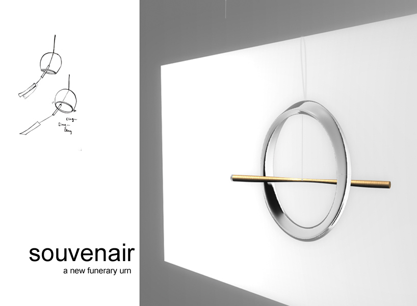


family tree (above)
digital memorial
museum of life
cocoon - if is just planted onto tree
If interested, may check out the winner's scheme individually from designboom webpage.
Friday, 31 May 2013
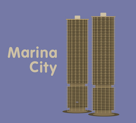
Chicago - Five Great Buildings by Al Boardman
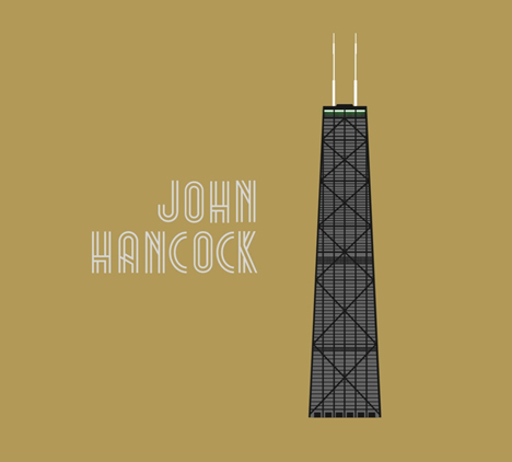
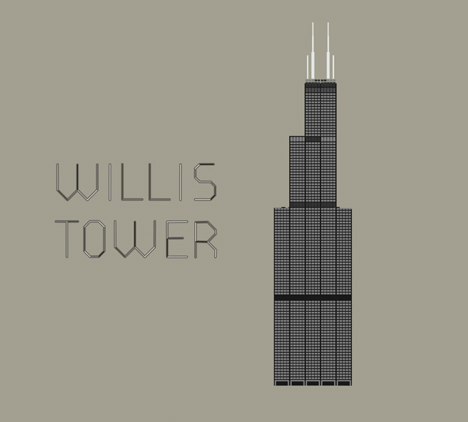

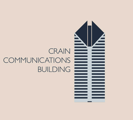
- 344-metre John Hancock Observatory by
US firm Skidmore Owings & Merrill, home to offices and restaurants (+ observatory), as well as about 700 condominiums.
- 442-metre Willis Tower (also by Skidmore Owings & Merrill) - more commonly known as the Sears Tower and until recently the tallest building in the US, function as office, observation (Skydeck) and communication tower.
- 423-metre hotel and apartment block (designed by architect Adrian Smith of Skidmore, Owings and Merrill) owned by billionaire real estate developer Donald Trump.
- 177-metre designed by Sheldon Schlegman of A. Epstein and Sons, has 41 floors of tenant space and the two spires at the top cover the main roof and HVAC equipment.
- 179-metre mixed-use residential/commercial building complex by architect Bertrand Goldberg, being the first building in the United States to be constructed with tower cranes.
source from dezeen and wikipedia. check out more of Al Boardman works.
Wednesday, 24 April 2013
How Much Do Your Personal Assets Weigh, Mr. Foster ?
Architizer News reported by Kelly Chan

Important news flash for parents who want their children to be famous, successful architects: Of this year’s list of the 2,000 wealthiest people in Britain, only one of them is an architect. That one architect — surprise — is Sir Norman Foster.
Last year, Foster was joined by his colleague Zaha Hadid in Britain’s “Rich List,” though Hadid was absent from the elite manifest this year. But coming up strong at #522, Foster is keeping the myth of the moneyed, skyscraper-designing professional alive and well despite having seen a recent dip in profits at his firm Foster + Partners.
According to Dezeen, the architect has an estimated personal fortune of almost $230 million, a chunk of which comes from selling 40% of his practice in 2007 for $180 million. Foster continues to hold a 45% stake in the firm, which has its hand in everything, from the controversial renovation of the New York Public Library main branch, to the wildly over-budget Apple Campus in Cupertino, California, to a fantastical proposal to 3D-print houses on the moon. Foster was even the subject of a 2010 documentary called “How Much Does Your Building Weigh, Mr. Foster?”, which presented the architect’s projects as elegantly designed solutions to urban problems and reaffirmed that Foster is one of the few architects the general public knows by name.
Wednesday, 13 February 2013
Guggenheim Extension Story
Frank Lloyd Wright's Guggenheim Museum opened to the public in 1959 and houses a collection of impressionist, modern and contemporary art.
"Entering into the spirit of this interior, you will discover the best possible atmosphere in which to show fine paintings or listen to music. It is this atmosphere that seems to me most lacking in our art galleries, museums, music halls and theaters."
— Frank Lloyd Wright. "Frank Lloyd Wright", The Architectural Forum, January, 1948, Vol 88 Number 1. p89. (reference from greatbuildings.com)
It has been 50 over years, what if there is an extension to this iconic building in New York ?
Lets find out what this architecture office has to show the world...

the existing building - image source : britannica.com

section - image source : blogs.artinfo.com
Guggenheim Extension Story by Oiio Architecture Office
Oiio Architecture Office of New York and Athens has come up with a concept to extend Frank's Lloyd Wright's famous Guggenheim Museum in New York by extending its spiralling form up into the sky.
"What if we decided we needed a little more of Guggenheim?" question the architects, whose plans show a structure with almost three times as many floors as the iconic museum that was designed by Wright during the 1940s.


The office names
the project Guggenheim Extension Story, as a reference to the
unlikelihood that any extension to the museum would ever really take
place.


"Guggenheim museum has become so iconic, so emblematic and hermetic in our minds that it can no longer be touched by architects!" say the team, before adding: "Even if its own creator were to propose an alternation of its form, New Yorkers would suddenly feel as if they have lost a dear old friend."
adapted from dezeen
and Guys ! please read what the team has explained first before you make any judgement. :]
Friday, 11 January 2013
Facade Project / Mapping !
I always felt that UMNO building can do so much better.....
Even to promote for BN.. it can be more interesting too......
at least TM building is doing better than that..
Some examples to share which is really can be fun to watch and some even to participate !
Even to promote for BN.. it can be more interesting too......
at least TM building is doing better than that..
Some examples to share which is really can be fun to watch and some even to participate !
Wednesday, 9 January 2013
Monday, 17 December 2012
eleven eleven | Elizabeth Priore

Herzog & de Meuron’s 1111 Lincoln Road multi-storey car park in Miami Beach also plays host to parties, yoga classes and weddings, explains proprietor Robert Wennett in this movie produced by filmmaker Elizabeth Priore (+ photographs by Hufton + Crow).
adapted from dezeen
Monday, 22 October 2012
Sunday, 16 September 2012
"copying is both fundamental and dangerous to architecture"
FAT director Sam Jacob
explains why he believes that “copying is both fundamental to how architecture
develops and something that threatens its foundational belief in originality,”
in this movie we filmed at the Venice
Architecture Biennale, where the firm has created an installation called The Museum of Copying.
Friday, 31 August 2012
A little collection of comics
Take a break and read some comics ~ :D


for more comics by Grant Snider : http://www.incidentalcomics.com/
Wednesday, 9 May 2012
Thursday, 26 April 2012
How to present your Presentation Board?
I think all of us have problem with laying out our presentation boards, regardless of whether it's design subject or others. The composition of our presentation boards are crucial for understanding of others and Miss Hui Ping touched on that yesterday. So I decided to share with you guys about my findings.
It's taken of another blog which I stumbled on while researching for Architecture Presentation Boards. Click here. There's other examples of presentation boards there as well. Go take a look. It might not be the best of the best but at least it's something we can all learn from and improve from there.

Here listed are 20 ways.
1. No background colour, preferably
white, be plain because our focus is not on the striking background but
rather on the content.
2.
Use of less than 3 types of fonts, try to avoid using too many
different sizes of words too to make it more formal, use fonts that are
suitable (no curvy and must be easy to be understood).
3.
Content (always begin with key plan to site plan and to plan (s) of
the structure of your design, then elevations, sections, perspective,
axonometric, isometric (sometime).
4.
Include development sketches, people love to read how you develop your
idea and transform the first simple draft into final creative design
in sketches.
5.
Good skills in drawing manually – include rendering, shading and line
weight skills to enhance the drawings and to put ‘life’ on your
drawings as though it is real. Include the background and site context
in drawings too. If you have drawing software and your lecturer asked
you to use it, then use it. (if you know too).
6.
Present your ideas in short but informative sentences (better in
keywords and then you present your own ideas orally), no essays or
paragraphs in presentation boards, people don’t love to read long words
on boards.
7.
Proper and systematic organization and composition of presentation
boards, arrange all drawings, ideas (words), pictures, etc in term of
its importance in the project.
8. The title should be clear that people will look at it first before going through your boards, remember no fancy colours too.
9.
Remember to include your name on the boards too. If the boards are
separated, then include your name on each board to show that it is your
work. Be proud of your own masterpiece. Usually on bottom right hand
corner of the board. It is better to have one long board rather than
having separated ones.
10. Satisfy all the requirements set by your lecturers or clients. This is up to the demand of the one who will grade your work.
11.
Pictures on the presentation boards should be clear and show clearly
the aim of putting the pictures there too. However, pictures should not
overwhelmed your overall boards. Drawings and sketches should be
scanned into the file with accurate scale and with proper proportion.
12.
Use the programme that you are comfortable with, that you know how to
use efficiently on it in creating your boards – like Adobe Photoshop,
Sketch Up, etc. (better to be the latest version, more functions). If
you do not know, learn.
13.
Never create all of your boards manually, no writing, no pasting, it
will ruin it. If it is this way, the boards will look like collages
rather than an efficient presentation boards.
14.
Include your thinking (abstract) into the boards too, usually
alongside with the main points (ideas) that you have stated on the
boards. This will put you on top of others.
15.
Provide some empty space to ‘free’ your boards. It is no good to have a
board full of words, pictures, sketches, drawings squeezed together.
If the lecturer limit you to certain number of boards, you can actually
exceeds by one or two more, but don’t need to be too much. Remember,
don’t include rubbish (non-related stuff) into your precious boards.
16.
Neatness is important. After you have done your board and printed it
out, do not fold them, put them in plastic folder and keep it safe till
the day of submission. It is your valuable work, once destroyed, have
to print again and waste money again.
17.
Do not do your board at last minute work. It will totally ended up
having a bad presentation boards. Try to manage your time, maybe today
you will be doing on this part of boards, the other day on the others,
and few more extra days for you to touch up and finalize your boards.
18.
Be creative. This is the most important criteria for an architect. Try
to show your creativity through the boards too, if you can. Remember,
if you think you can, then you can!
19.
Show which boards should come first if all your boards are separated –
like Sheet One, Two, Three, …… Usually at bottom left hand corner of
the boards. This will not confused your lecturers or clients as they
are having look at these.
20.
Try to communicate to the others (lecturers or clients or even
friends) through the boards. Sound hard to get what I mean? This you
have to think yourself. Your boards must attracts attention to all
people (not through its striking colour, but through its content).
It's not much, but at least I hope it might shed some light for you guys. There's always room for improvement! :) Of course, in the end, it's up to you how you want your presentation board to look like, to represent you and to convey your message to others. Now, hit the books! Good luck to all for finals! :)
Saturday, 14 April 2012
Museum of Handcraft Paper, Yunnan, China
Was searching for my history example, but seems not quite what I wanted, but is ok for an extra information :]
Design by Li Hua (one of the speakers for this year's Datum) / TAO (Trace Architecture Office)
Design by Li Hua (one of the speakers for this year's Datum) / TAO (Trace Architecture Office)

The museum of handcraft paper is located in a field next to Xinzhuang village under Gaoligong Mountain of Yunnan, a world ecological preserve area in southwest of China.

The village has a long tradition on handcraft paper making. The museum project is a part of the plan for preservation and development of traditional resources, in which papermaking will be preserved as cultural heritage and contribute to community growth.

To exhibit the history, technique and product of paper making, this museum consists of exhibition space, bookstore, work space and guest rooms for artist and visitors. The site is next to the main road entering the village.

The museum functions like a preview window of the village, in the sense that the whole village will function as a big museum because each home in village will open to the visitors showing papermaking process.

The museum is thus conceived as a micro-village, a cluster of several small buildings. The building scale is in concord with adjacent village and landscape.

The spatial concept is to create a visiting experience alternating between exhibition inside and landscape outside when visitor walks through the galleries on ground level, so as to provoke an awareness of the inseparable relationship between paper making and environment. On second level, there is an open work space and meeting room.

Through an outdoor stair, one can walk up to roof terrace with a view to the bamboo roofscape of galleries below, and a glass roofed veranda space facing east where one can have a panoramic view to Gaoligong mountain. The design is aimed at making a building rooted in local environment. This leads to the concept that the construction is to maximize the usage of local materials, construction method and traditional craftsmanship and to be built completely by local builders. Yet it also employs the modern materials and technique available in local context.

Thus the construction of museum will be both a preservation and transformation of local building tradition. It is an architectural attempt of combining modern quality with regional character by using local resources and suitable techniques in the rural context of contemporary China.

The building is designed with traditional Chinese wood structural system featuring nail-less tenon (SunMao) connection, which can be skillfully built by local builders. Local materials such as fir wood, bamboo, volcano stone and handcraft paper are used for exterior finish, roof, floor and interior finish respectively. With time passed, these materials will worn and fade into a more harmonious color with the landscape. These living materials hint a sense of time on building.

The form and detail of building is conceived to respond to the views, natural light, and climate. In galleries, the breeze blows through the porous stone footing at the bottom of exterior wall for ventilation so that the wall is free of operable windows. Thus it gives more wall area to the exhibition.

The openings on the wall are purely for views to the outside. A single piece of glass is set in the opening and turns it into a picture of landscape. The high windows on side wall of gallery introduce natural light into the exhibition space yet avoiding the glare at eye level. The handcraft paper is pasted on the bottom side of glass roof of linking space between galleries so as to gain diffused light from above.

On facade, the exterior wall stops at the bottom of beam level and exposes beam and part of columns at the corners. Also with exposed roof structure at interior space and the stone column base on facade, these details reveal that the building is supported by the column and beam system instead of wall.

The handcraft paper on interior finish is applied on a wood frame with 45cm by 45cm square module (limited by the paper size but guarantees the smoothness of wall). The exhibition niche layout based on this module is integrated into the wall. The white paper wall in galleries creates a soft and warm atmosphere and keeps the space abstract.

The construction of building is completed by a team of local farmer builders. Architect built models in various scales to communicate the spatial, structure and detail concept with builders because they are not used to read the working drawings. However they are good at building things in mind and they worked efficiently with concept clarified.
Adapted from : http://www.dezeen.com/2012/02/16/museum-of-handcraft-paper-by-tao/ and for more images on the project.
Monday, 20 February 2012
Ecological Children Activity and Education Center
this is another children education center.
article from Archdaily.


URL: http://www.archdaily.com/34946/ecological-children-activity-and-education-center-24h-architecture/
article from Archdaily.

The 6 star hotel resort Soneva Kiri is located on Koh Kood, an island in the Gulf of Thailand. At this unique site, 24H-architecture designed a series of ecological icons to contribute to Six Senses’ high ambitions in design and ecology. Most prominent is The Children Activity and Learning Centre, which will provide visiting children a wide range of entertaining activities as well as raise the level of ecological awareness with them. This Den provides an Auditorium/Cinema for films, lectures and plays, a library with books on permaculture and local traditions, an Art room, a Music room and Fashion room, thus giving children both creative and ecological education while playing.
The Den is located at a rocky slope close to the sea. With its Manta-ray inspired bamboo dome, perched in an elevated position so as to offer magnificent views, it seems to launch itself into the bay. The structure and roof are made from local Thai bamboo, thus contributing further to the ecological approach of the resort. The interior is made from local plantation River Red Gum wood and rattan structural elements for the inner domes.
Next to the Den, the site provides a sleeping pod for toddlers, and a toilet building as well as a cooking cave with vegetable garden for the children to prepare their own lunch with a special cook.
The design adopts all bioclimatic aspects to suits its humid tropical environment. The roof cantilevers up to 8m acting like a big umbrella providing shade and protection from the heavy rains. The open design with the translucent elevated rooftop and setback floors allow a natural airflow inside and the use of natural daylight, limiting the building’s energy consumption.


Friday, 17 February 2012
Green school in bali
This article was sent by AR Lee Chor Wah via email.
Welcome to the green school in Bali , Indonesia . It provides its students with an education about the amazing environment that we live in. It is a holistic and relevant education. During the construction, only bamboo, elephant grass and clay were used. Cement was used just in some places in the foundation. The central and the most important building is the "heart of the school." It is perhaps the largest building in the world built entirely from bamboo. Its dimensions are 18 meters high and 64 meters long. General area of the school includes a variety of structures: apartment buildings, classrooms, office building, and cafes. The school gets electricity from environmentally friendly sources of energy: hydraulic turbine generators and installed solar panels. It seems that considering the way we are polluting the earth, everyone should attend


Welcome to the green school in Bali , Indonesia . It provides its students with an education about the amazing environment that we live in. It is a holistic and relevant education. During the construction, only bamboo, elephant grass and clay were used. Cement was used just in some places in the foundation. The central and the most important building is the "heart of the school." It is perhaps the largest building in the world built entirely from bamboo. Its dimensions are 18 meters high and 64 meters long. General area of the school includes a variety of structures: apartment buildings, classrooms, office building, and cafes. The school gets electricity from environmentally friendly sources of energy: hydraulic turbine generators and installed solar panels. It seems that considering the way we are polluting the earth, everyone should attend
Subscribe to:
Posts (Atom)


