
Friday, 28 February 2014
Wednesday, 27 November 2013
The Beauty of Mathematics: A Visual Demonstration of Math in Everyday Life
"Mathematics, rightly viewed, possesses not only truth, but supreme
beauty — a beauty cold and austere, without the gorgeous trappings of
painting or music." —Bertrand Russell
(quote from the video)

image from colossal
*best watch in full screen
From the mathematical equation on the left, mathematical model in the middle, to the short videos of everyday occurrence that brilliantly shows us the connection between them in this triptych format short video by Yann Pineill and Nicolas Lefaucheux of Paris video production agency Parachutes.
(quote from the video)
image from colossal
*best watch in full screen
From the mathematical equation on the left, mathematical model in the middle, to the short videos of everyday occurrence that brilliantly shows us the connection between them in this triptych format short video by Yann Pineill and Nicolas Lefaucheux of Paris video production agency Parachutes.
Sunday, 6 October 2013
Below The Boat
Wood Chart created by the couple Robbie and Kara Johnson from Bellingham, a 'topographic' map of the underwater. Each layers of laser-cut contours are glued together and certain layers are hand-coloured blue to differentiate between land and water.
quote from belowtheboat webpage :
"The result is stunning. It lifts the surface of the water back like a veil, exposing the often-overlooked, under-explored, awe-inspiring world that lies below. To those familiar with the floor of the ocean or the bed of a lake, it's a beautiful reminder of the deep channels, sharp drop-offs, and mountainous landscapes that are otherwise hidden from view. To the uninitiated, it's wonderfully eye-opening; as though the world has suddenly taken on a fourth dimension. "
I think this is a great idea not just as a nice tangible piece of information but also to allow explorers on boat to know the floor of the water better, especially if exploring to any dangerous spots. Keep up the good work and expand the coverage for the collections, guys !


the creators' favourites (below) :


all images from Below the Boat
quote from belowtheboat webpage :
"The result is stunning. It lifts the surface of the water back like a veil, exposing the often-overlooked, under-explored, awe-inspiring world that lies below. To those familiar with the floor of the ocean or the bed of a lake, it's a beautiful reminder of the deep channels, sharp drop-offs, and mountainous landscapes that are otherwise hidden from view. To the uninitiated, it's wonderfully eye-opening; as though the world has suddenly taken on a fourth dimension. "
I think this is a great idea not just as a nice tangible piece of information but also to allow explorers on boat to know the floor of the water better, especially if exploring to any dangerous spots. Keep up the good work and expand the coverage for the collections, guys !
the creators' favourites (below) :
all images from Below the Boat
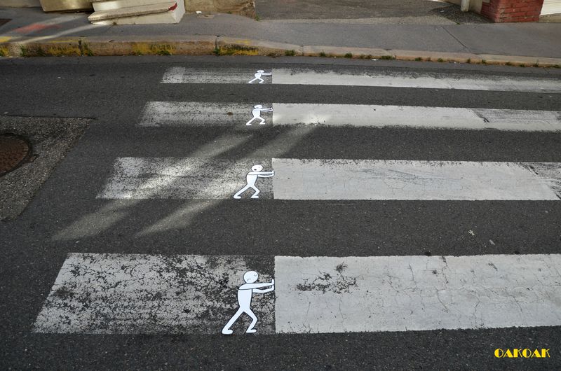
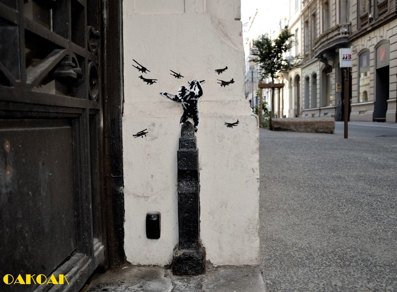
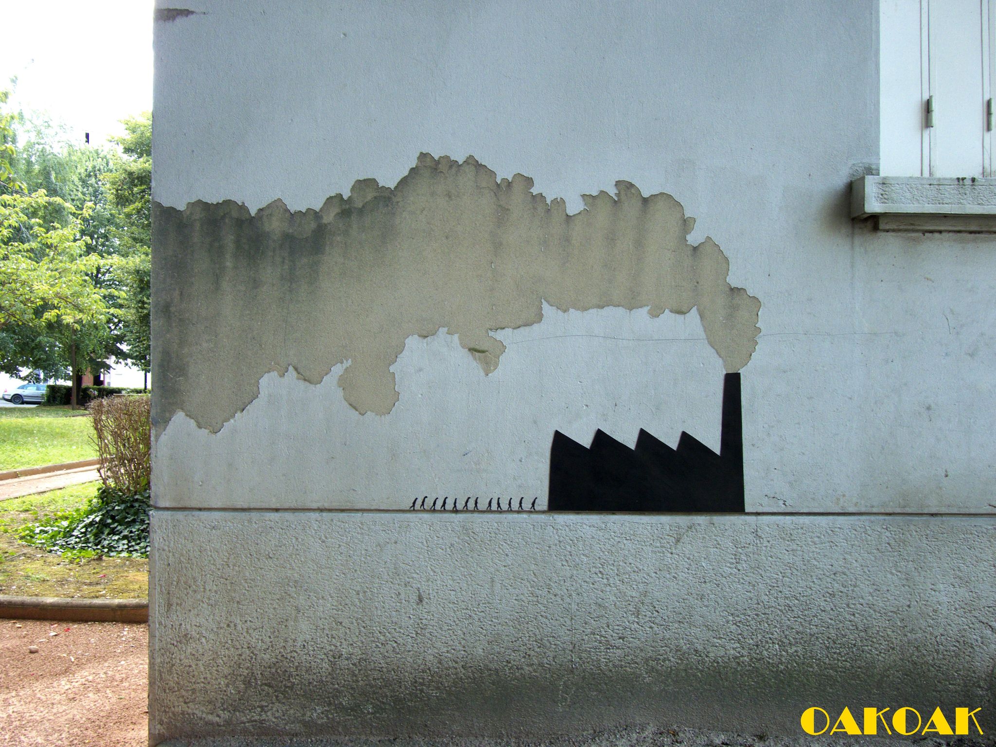
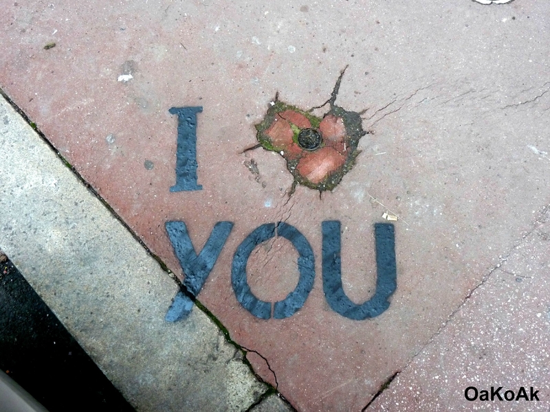
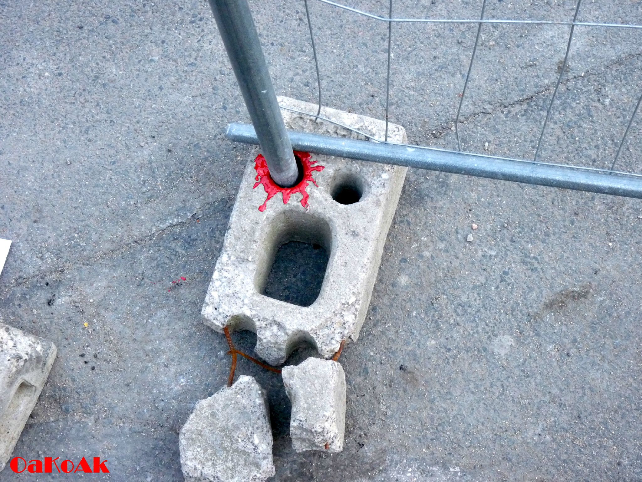
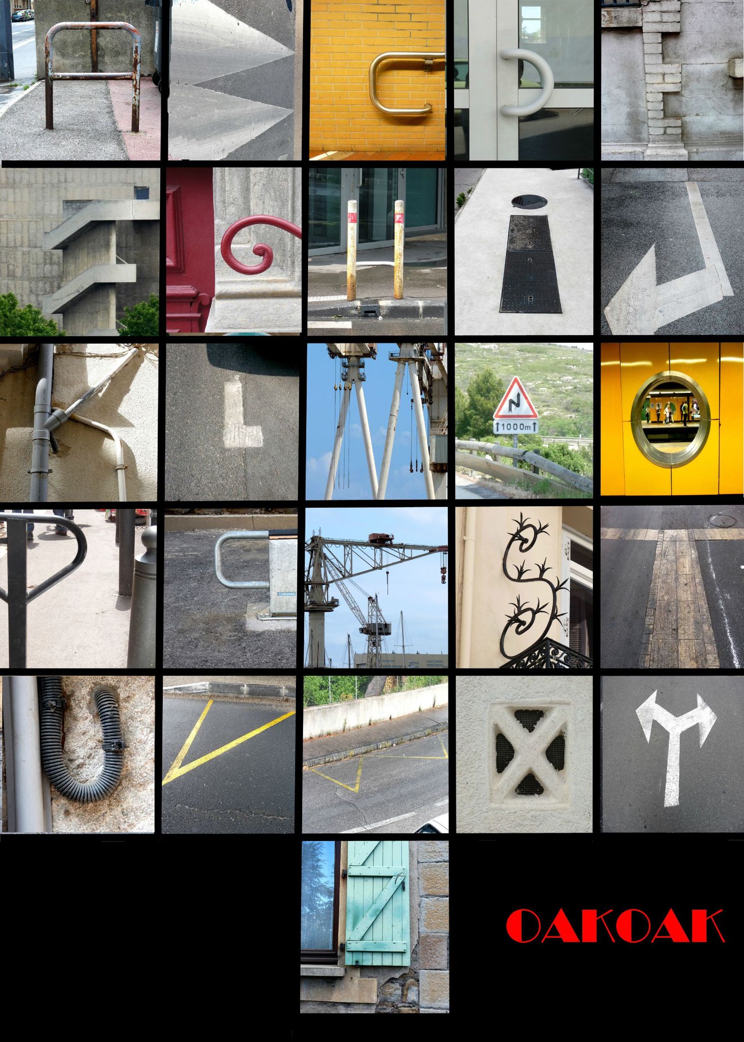
Street Art by OaKoAk
OAKOAK
Pen-pusher by day, street art superhero by night, St Etienne sensation OakOak's hilarious, imaginative, irreverent and sometimes a little macabre street work has filled column inches from BBC Brazil to Beijing's biggest daily newspaper. It has sat pretty on the top spot of "The best of ..." at juxtapoz.com for four months. Daubing simple graffiti and paintings on urban features – often the broken ones – OakOak does what street art does best, amuse and inspire people of all ages and demographics by appropriating the city's less appealing elements.
OakOak is a street artist, but he is not a fine artist painting in public. His work, either on the streets of his native St Etienne, France, or made on his travels, is opportunistic and never "authorised". He is completely untrained in art and works full-time in an office. Whilst his favourite artist is Amedeo Modigliani, he cites his main influences as football, comic books, video games and his home town. "I like this city, her atmosphere" OakOak says of Saint Etienne "and I wanted it to look nicer. It was an industrial city with many coal mines; now it's in regeneration and still quite poor. But it's easily travelled by foot with awkward aspects ideal for art. I saw shapes everywhere, and wanted to realise them."
adapted from The outsiders
photo image and more works from OaKoAk website


Sunday, 28 July 2013
Design for Death Competition
Questions for us :
Few months back, there was this competition titled Design for death organised by The LIEN FOUNDATION and ACM FOUNDATION to encourage the creative people internationally and especially tthe design community to re-think and re-imagine deathcare for the future.
The round ONE competition mainly focuses on product, ceremonial, memorial, etc. design has ended in June so now the round TWO competition which is the architecture category is even more challenging at the same time exciting to design !!
Closing date for registration and submission : 1st September 2013
Quote from the original objective given :
DESIGN FOR DEATH will encourage creativity and establish leadership through the intersection of design, thanatology and deathcare to inspire future practical initiatives. It will challenge and change perceptions about the ways in which families honor, remember and celebrate the lives of their loved ones.
for the full detail on the competition click HERE
I find the proposed design by the winners (and also mostly) are very eco friendly and spiritually emotionally personally connected with the griever or so, it will be a great inspiration or collaboration to design in the architecture category ! I'm really looking
forward to learn from the method and solution they respond to deathcare by others
around the world.
These are proposals I personally liked, in term aesthetically, technologically
or more meaningful to me.


family tree (above)

digital memorial

museum of life

cocoon - if is just planted onto tree
If interested, may check out the winner's scheme individually from designboom webpage.
What is the future of deathcare?
How can design shape the future of deathcare?
The new interpretations of the way we deal with death and dying, and
How the use of space influences the way we grieve and remember the dead.
Few months back, there was this competition titled Design for death organised by The LIEN FOUNDATION and ACM FOUNDATION to encourage the creative people internationally and especially tthe design community to re-think and re-imagine deathcare for the future.
The round ONE competition mainly focuses on product, ceremonial, memorial, etc. design has ended in June so now the round TWO competition which is the architecture category is even more challenging at the same time exciting to design !!
Closing date for registration and submission : 1st September 2013
Quote from the original objective given :
DESIGN FOR DEATH will encourage creativity and establish leadership through the intersection of design, thanatology and deathcare to inspire future practical initiatives. It will challenge and change perceptions about the ways in which families honor, remember and celebrate the lives of their loved ones.
for the full detail on the competition click HERE
First round competition - product / ceremonial / memorial design
Check out the video for the summary of this competition.I find the proposed design by the winners (and also mostly) are very eco friendly and spiritually emotionally personally connected with the griever or so, it will be a great inspiration or collaboration to design in the architecture category ! I'm really looking
forward to learn from the method and solution they respond to deathcare by others
around the world.
These are proposals I personally liked, in term aesthetically, technologically
or more meaningful to me.
family tree (above)
digital memorial
museum of life
cocoon - if is just planted onto tree
If interested, may check out the winner's scheme individually from designboom webpage.
Wednesday, 26 June 2013
Outdoor advertising with a purpose
street furniture billboards by IBM + ogilvy paris
for 'people for smarter cities'
I personally like this project very much, not just because they created a smart advertising but the purpose it gave to the people in the city. Just a simple additions, makes A difference for the people in their daily routine.
IBM is committed to creating solutions that help cities all over the world get smarter, in order to make life in those cities better.
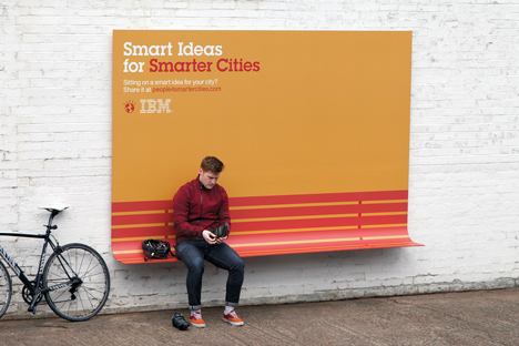
 IBM and ogilvy & mather france work together to spark positive change with the 'people for smarter cities' cities initiative, and unite city leaders and forward-thinking citizens. To spread the word, Ogilvy created outdoor advertising with a purpose: a bench, a shelter and a ramp that would be useful to city dwellers. the campaign believes that fundamental services - such as roadways, mass transit and utilities - make a city and neighborhoods more desirable to live in. conceived in three different color variations, the graphic components of the different advertisements reference typologies such as wood slats and protective awnings similar to that its physical counter-part.


adapted from designboom and dezeen
The Chair Project
This campaign also reminded me of this project done by our local students to resolve
the lack of seatsat the lrt & bus station in Kelana Jaya. Although I would say the main
problem is not the seat but the public transport, but at least they DID SOMETHING to
solve part of the problems. Rather to sit and wait something to happen like most people do
(I'm sorry but I have to admit I'm one of them), I truly respect them for their effort on this.
Thank you for doing something !! and hope that many others (I believe they are) including
myself will be able to do something to resolve something...
read more on the star report on the chair project
for 'people for smarter cities'
I personally like this project very much, not just because they created a smart advertising but the purpose it gave to the people in the city. Just a simple additions, makes A difference for the people in their daily routine.
IBM is committed to creating solutions that help cities all over the world get smarter, in order to make life in those cities better.
Initially launched in London and Paris, IBM has plans to take this idea to cities around the world and inspire citizens to think about simple ways they can help make their cities smarter.
adapted from designboom and dezeen
The Chair Project
This campaign also reminded me of this project done by our local students to resolve
the lack of seatsat the lrt & bus station in Kelana Jaya. Although I would say the main
problem is not the seat but the public transport, but at least they DID SOMETHING to
solve part of the problems. Rather to sit and wait something to happen like most people do
(I'm sorry but I have to admit I'm one of them), I truly respect them for their effort on this.
Thank you for doing something !! and hope that many others (I believe they are) including
myself will be able to do something to resolve something...
read more on the star report on the chair project
Friday, 31 May 2013
Chicago - Five Great Buildings by Al Boardman


- 344-metre John Hancock Observatory by
US firm Skidmore Owings & Merrill, home to offices and restaurants (+ observatory), as well as about 700 condominiums.
- 442-metre Willis Tower (also by Skidmore Owings & Merrill) - more commonly known as the Sears Tower and until recently the tallest building in the US, function as office, observation (Skydeck) and communication tower.
- 423-metre hotel and apartment block (designed by architect Adrian Smith of Skidmore, Owings and Merrill) owned by billionaire real estate developer Donald Trump.
- 177-metre designed by Sheldon Schlegman of A. Epstein and Sons, has 41 floors of tenant space and the two spires at the top cover the main roof and HVAC equipment.
- 179-metre mixed-use residential/commercial building complex by architect Bertrand Goldberg, being the first building in the United States to be constructed with tower cranes.
source from dezeen and wikipedia. check out more of Al Boardman works.
Wednesday, 24 April 2013
How Much Do Your Personal Assets Weigh, Mr. Foster ?
Architizer News reported by Kelly Chan

Important news flash for parents who want their children to be famous, successful architects: Of this year’s list of the 2,000 wealthiest people in Britain, only one of them is an architect. That one architect — surprise — is Sir Norman Foster.
Last year, Foster was joined by his colleague Zaha Hadid in Britain’s “Rich List,” though Hadid was absent from the elite manifest this year. But coming up strong at #522, Foster is keeping the myth of the moneyed, skyscraper-designing professional alive and well despite having seen a recent dip in profits at his firm Foster + Partners.
According to Dezeen, the architect has an estimated personal fortune of almost $230 million, a chunk of which comes from selling 40% of his practice in 2007 for $180 million. Foster continues to hold a 45% stake in the firm, which has its hand in everything, from the controversial renovation of the New York Public Library main branch, to the wildly over-budget Apple Campus in Cupertino, California, to a fantastical proposal to 3D-print houses on the moon. Foster was even the subject of a 2010 documentary called “How Much Does Your Building Weigh, Mr. Foster?”, which presented the architect’s projects as elegantly designed solutions to urban problems and reaffirmed that Foster is one of the few architects the general public knows by name.
Tuesday, 23 April 2013
Brutal simplicity of thought of the day #8

adapted from the Brutal simplicity of thought book by M&C Saatchi Worldwide
TREE or TOWER !?
I always noticed this tree or not a tree look a-like object around the city. Till I found out is actually a telecommunication tower trying to blend with the 'green' of the surrounding....... which made me wonder why do they try to camouflage the structure in a very weird way that ended up becoming a more alien object than the surrounding !?
Well, not just me who have this interest, here are some photographers who have a collection on it, and they have better elaboration on it. Take a look at their work.
Photos of Cellphone Towers Disguised as Trees
Adapted from Exposure Guide article by Patricia Ramos

Function combined with form is always an achievement. Function however does not always carry aesthetics. This does not mean that an object’s usefulness is diminished, nor should it be condemned. Case in point is the ubiquitous cell phone tower. It is a web of these masts that allow telecommunications companies the ability to transmit voice calls and data to and from our smartphone devices. It is also part of the intricate Internet delivery system that we enjoy from our tablets, laptops and personal computers at home and at work. They surely have a well-deserved right to be called functional. But what an eyesore they are to behold. Thankfully our friends over at the telecom companies acknowledge this, and some have even mounted well-meaning efforts to camouflage these unsightly masts with dishes and antennas of varying sizes.

Being vertical, the towers were made to resemble trees. Regrettably, the attempt to blend the towers into the background did the opposite. Instead of obscuring the masts, there now stood this unidentifiable abomination. South African photographer Dillon Marsh‘s photo series called Invasive Species shows these foliage-adorned towers.
“In certain cases the disguised towers might not be noticed,” “But then an undisguised tower might not have been noticed either.” - Mash.


The world’s first palm tree cell phone tower called The Palm Pole Tower.
It made its debut in Capetown in 1996.
Another photographer, Robert Voit, has also documented tree cell phone towers in the United States, Parts of Europe, and Asia. Check out more of his work from his website.

photo source from Robert Voit webpage
To read more on the article, click here.
Instead of just copying the preset from other examples, maybe we could try to modify it - at least the species of the so called tree is more to our climate, as what I saw at the moment is exactly in those photos from top.... that makes more sense to try to camouflage it, I think (at least the tower in the photo directly above tried...) The result may or may not be good, at least an afford is made to improved it; if not, might as well do something totally different then... hmmm...
Subscribe to:
Comments (Atom)


