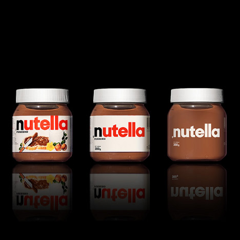
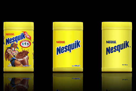
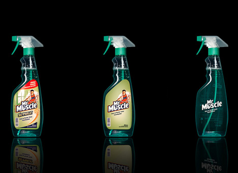
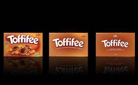
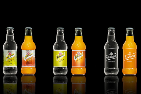
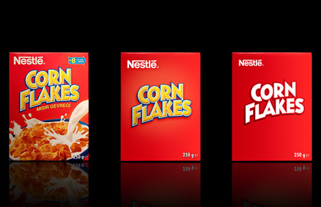
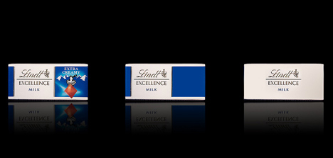
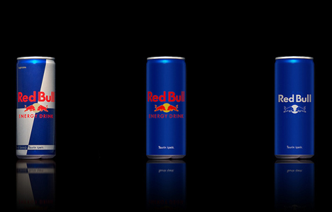
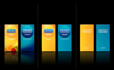
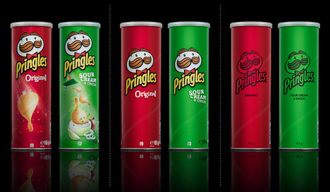
Like what the title has said, 'the Designers Antrepo have created conceptual packaging design for well-known supermarket products by stripping back the existing graphics in stages'
They even ask the reader which choice they will pick. So, what's yours ? :D
What is your choice in these 3 different variations?
1. Original variation
2. Simple variation
3. More simple variation
For more design from the designer : http://www.antrepo4.com/


For us as student of architecture i think we might more favour to the simplest design, but in this case i will put it the designer as con man. hahaha simpler and than simplest....can do it without much effort.
ReplyDeletesimple is nice xDD haha
ReplyDeleteit is true, as designer we will tend to pick the simplest... have you guys ever wonder why?... it is because we have been influenced by all the minimalist design we see in magazines and eventually got attracted into believing that it is 'beautiful'?.... i always and still wonder who determine my choice and understanding of beauty.... to start of with, i know all this perception or defination is man made (created by man)....like how blue is associated with baby boy and pink to baby girl (who decides that and why in the first place we follow suit or agree to that).....also the market or advertising has been a great influence in what we see and then choose to believe (some not)...like the saying goes, you are what you read.... http://www.iep.utm.edu/kantaest/... Kant talks alot about judgement and beauty and taste... check it out.. not an easy reading, you need to read 10 times in order to understand... however.... i personally also believe that my surroundings influence my understanding of beauty... everything is relative... like how we can determine if you are a good student, that is not solely because you have a good project, but because there is a worst project, so yours is better.... i wonder if we can discard everything around us and decide for ourself what is good or bad independantly? ....
ReplyDeleteanyway, diana, it is a good post....
after looking at the images for the second time... hmmm, i might not like all those simplest design which i did when i first saw them... nutella for eg looks like a medicine, nesquik looks like some carrefour brand product... and pringles, like some immitation pringles... i guess simple design comes as a whole package, with the right font and bottling.. not just scrapping off colours and graphhics.... for eg, to me only lindt looks simple and nice as the final result...
ReplyDeletehahaha.... i like nutella, mr. Muscle & Durex in the simplest design. others are just out of the nature of graphic designssss. everyone have their judge of beauty, i agree that~~ haha.
ReplyDeletebut i will still appreciate any arts created from anyone, because its call the beauty of creation~ am i right?...hahahaha